Behind the Scenes: House in the Trees Kitchen Renovation
We wanted to completely refresh the Kitchen at our House in the Trees project while still working with its original footprint. It was important to bring in more light both naturally and through our chosen palette. A few key design elements were used in order to help us to achieve this. The result - a sophisticated and stylish Kitchen that was still functional for this family.
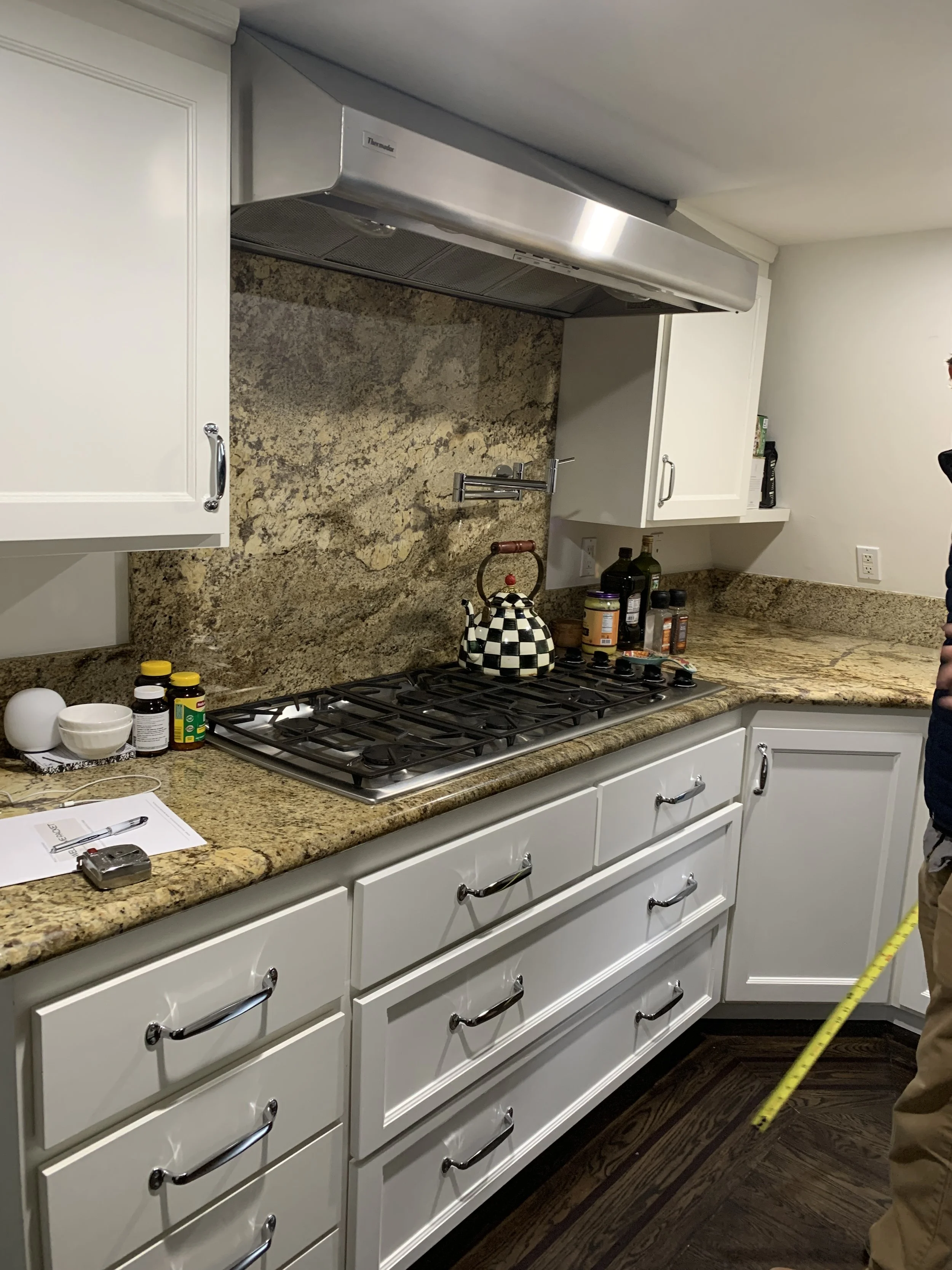
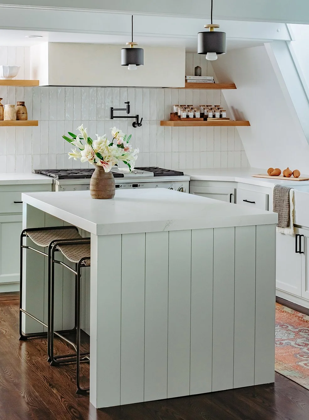
We started with the stove wall, replacing the upper cabinets with open shelves in a sand finish, encasing the hood with a more clean-lined look, and adding a range. At the island we used smaller scale drop down pendant lights that added interest and pulled from the finishes to be found woven throughout the space. These elements helped to instantly refresh the Kitchen, allowing it to feel light and airy.
BEFORE: Photo of the original stove wall
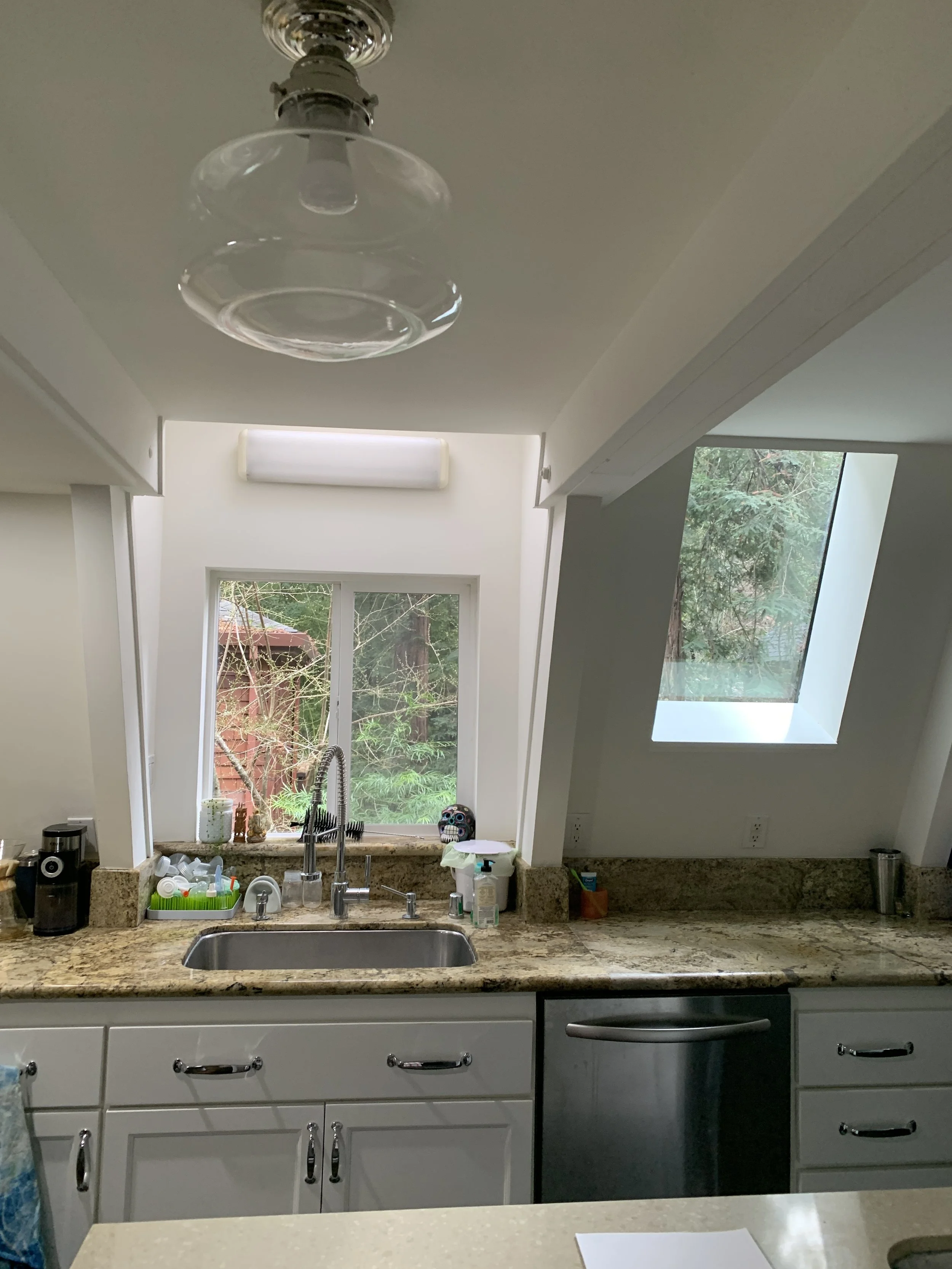
BEFORE: Original lighting at the island and above the sink
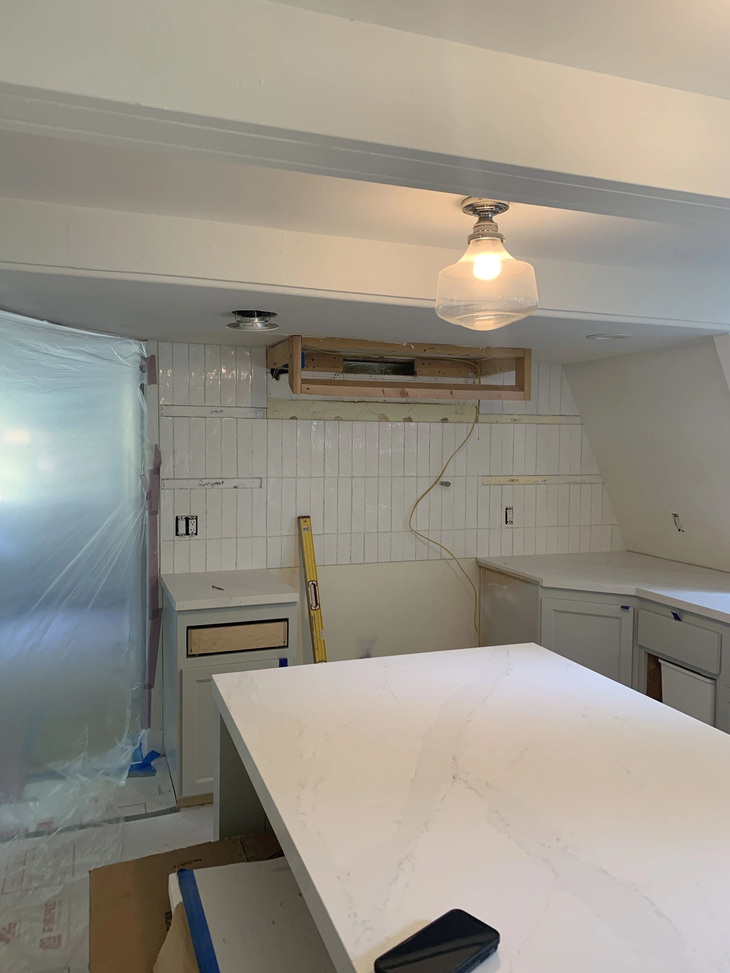
PROGRESS SHOT
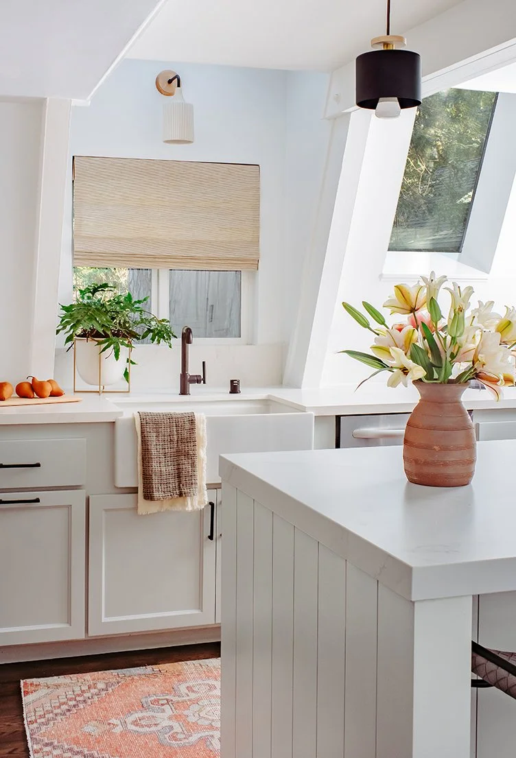
We wanted to create height while still needing to work with the original ceiling beams that could not be altered due to structural limitations. In order to do so we chose backsplash that was a textured white tile laid on the vertical and paired it with a paneled island detail to produce a vertical rhythm.
We chose soft paint tones for both the cabinets and island with matte black hardware and plumbing fixtures to add contrast. A new apron front sink helped to define this little nook, with views out to the redwoods and a woven window shade to add texture. Lastly, interest was added through the subtle detailing to be found in the woven leather counter stools and pops of color within the art and runner.

